
Top Interior Design Trends for 2025
Discover the biggest interior design trends for 2025
Riddhi Sharma
May 15, 2025
5 min read
Trends
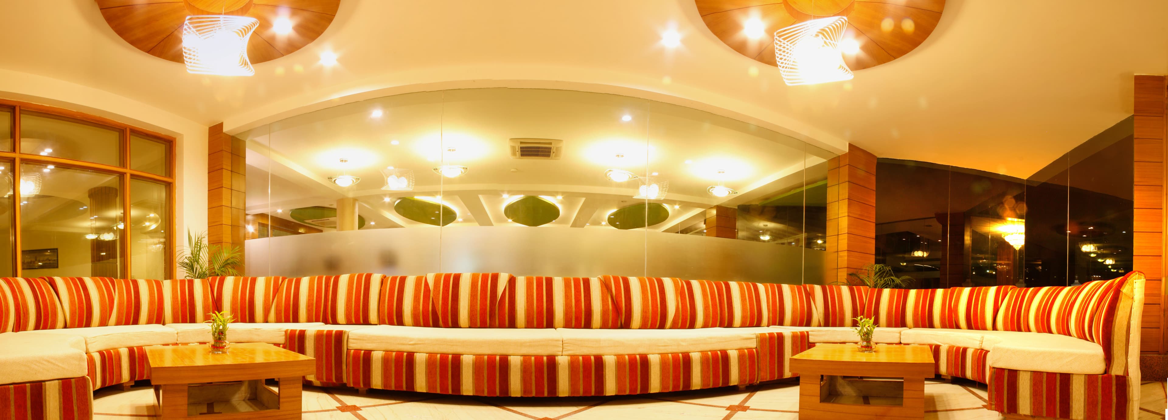
As we step into 2025, interior design continues to evolve with a focus on sustainability, technology, and comfort. This year promises exciting trends that blend aesthetics with functionality.
Key Features
- Sustainable materials and eco-friendly designs
- Smart home integration
- Biophilic design elements
- Bold color accents
Design Tips from Our Experts
- 1Start with a neutral base and add bold accents
- 2Incorporate natural elements like plants and wood
- 3Invest in quality furniture pieces
- 4Layer lighting for ambiance
About the Author
R
Riddhi Sharma
Interior Design Expert


Stay Inspired with Our Design Journal
Subscribe to our newsletter for exclusive design tips, trend reports, and special offers delivered to your inbox.
We respect your privacy. Unsubscribe at any time.


